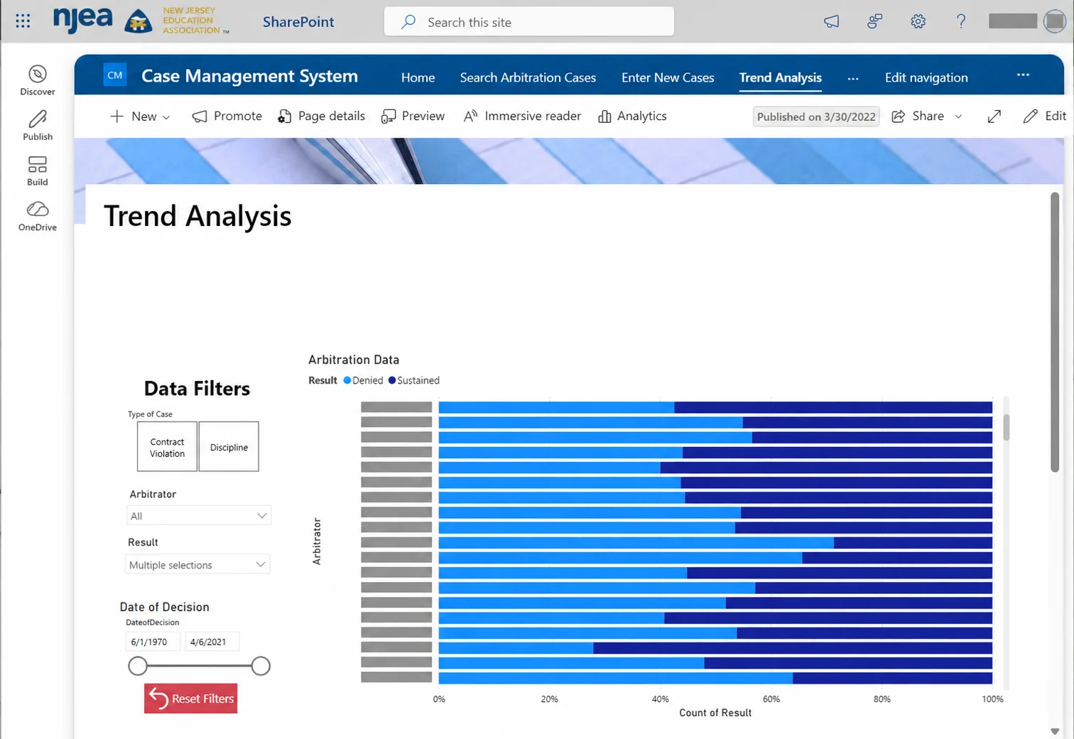
These examples bring case information, comparative analysis and reusable training resources into a structured SharePoint environment. Confidential rows and personal identifiers have been removed before publication.
Privacy-edited copy of a screenshot supplied by Tom Hayden. Identifiers have been removed with image-editing assistance; this image illustrates the interface, not a source for precise data analysis.
Give the question a route
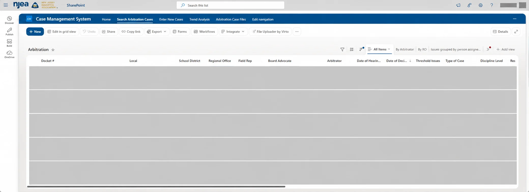
The case-management interface organizes information into consistent fields and searchable views. The portfolio shows the structure, not the confidential records.
Privacy-edited copy of a screenshot supplied by Tom Hayden. Identifiers have been removed with image-editing assistance; this image illustrates the interface, not a source for precise data analysis.
Help good work travel
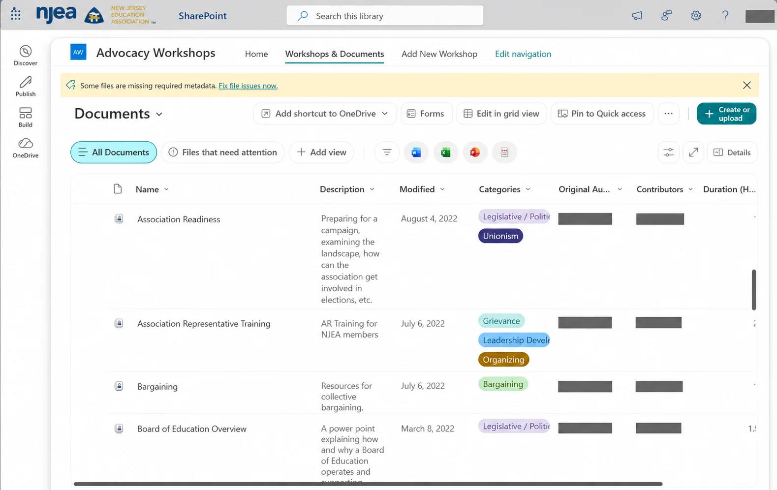
A workshop library can preserve the work of colleagues while helping someone else find the right resource by subject. Ownership, review dates and clear metadata keep useful material current.
Privacy-edited copy of a screenshot supplied by Tom Hayden. Identifiers have been removed with image-editing assistance; this image illustrates the interface, not a source for precise data analysis.
Carry this forward with the team
Tableau-style analysis belongs beside a definition, a source and an accessible table. With IS and Membership, Communications can decide which approved aggregates explain a public issue and which detailed views should remain behind the wall. CARS, SDIS and OneNJEA stay in their governed roles.
Project detail to add
Tom will add the project dates, precise responsibilities, collaborators, Tableau/SharePoint tooling details, training use and verified outcomes. The screenshots alone do not establish those facts.
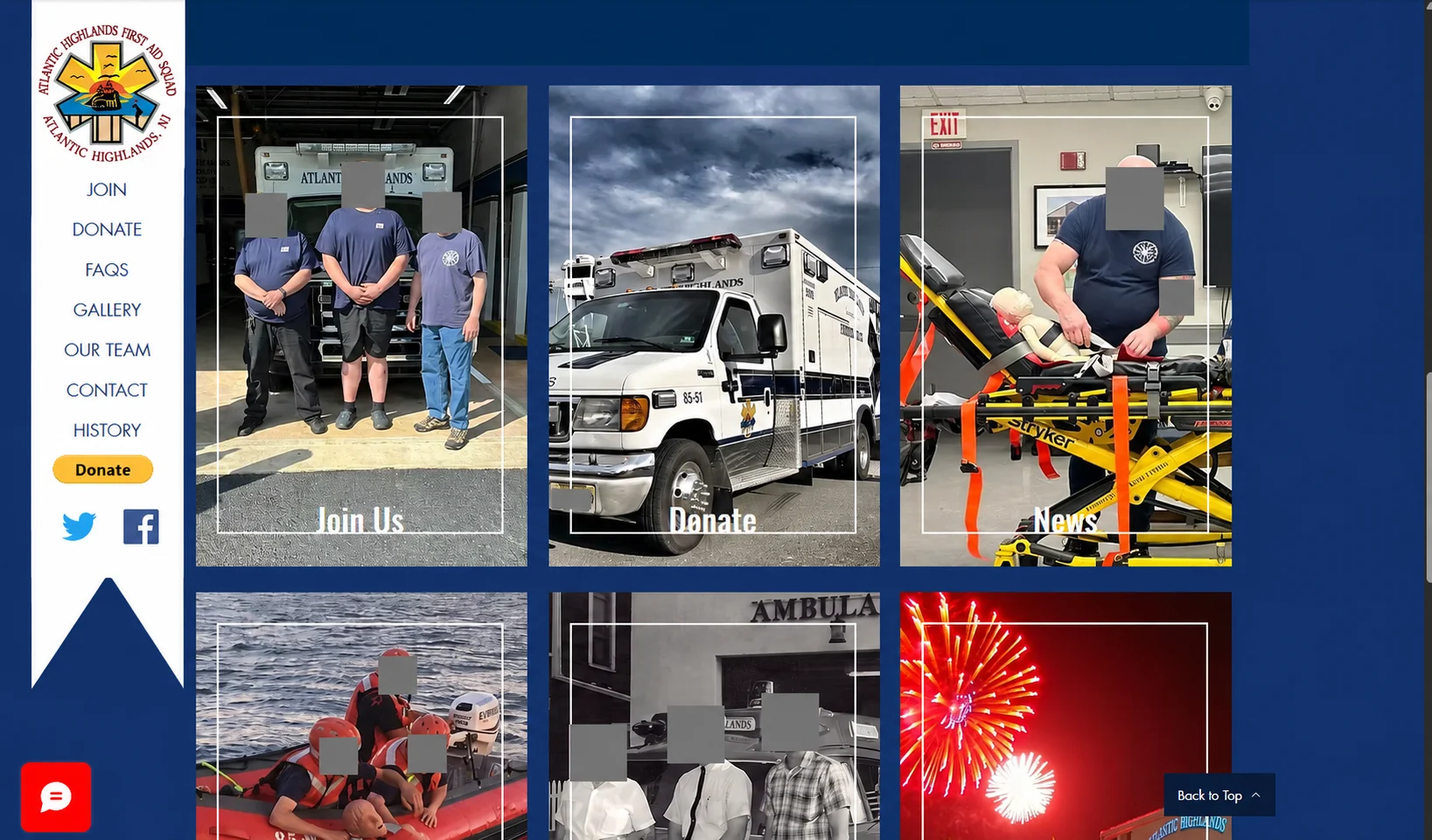
The Atlantic Highlands First Aid website uses photography to connect everyday service with clear actions: join, donate, read news and explore the squad’s history. The visual material does the explaining before a visitor reads a long introduction.
Privacy-edited copy of a screenshot supplied by Tom Hayden. Identifiers have been removed with image-editing assistance; this image illustrates the interface, not a source for precise data analysis.
The communications thread
A useful public-service story gives people context and a next step. Photography, a short caption, a volunteer invitation and a consistent message each do a different part of the job.
Bring the lesson back to local associations
Local identity matters. A shared WordPress foundation can support good mobile navigation, accessible templates and dependable publishing without making every local look or sound the same.
Project detail to add
Tom will add dates, personal responsibilities, writing links, photography credits, collaborators and measurable results for this work.
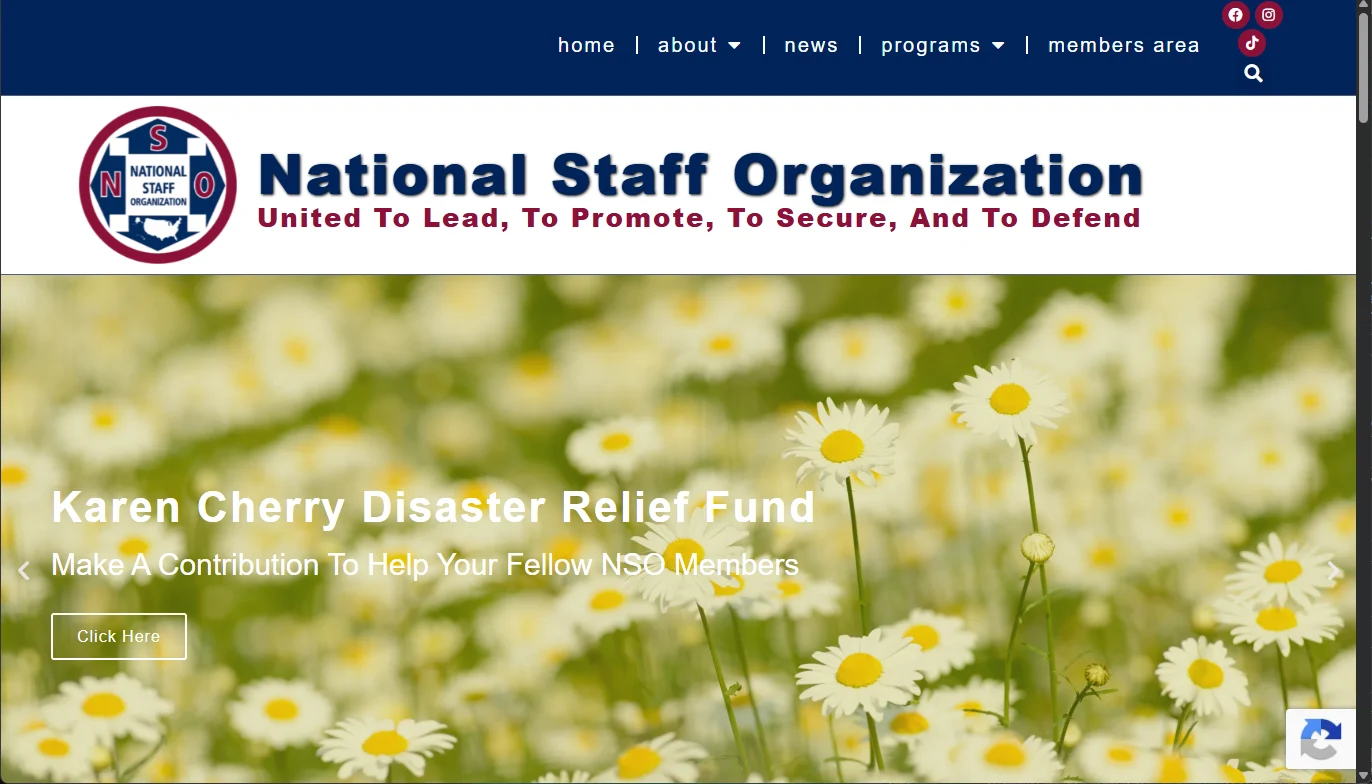
A public front door for the National Staff Organization, connecting identity, member resources and timely calls to action.
Actual website or platform screenshot supplied by Tom Hayden. Shown as portfolio evidence, not a live application.
The work
The National Staff Organization website is part of a wider communications practice: public information, member resources, email and a portal. The screenshot shows the public-facing site, including a disaster-relief appeal with a direct next step.
Why this matters
People arrive with different intentions. A member may be looking for a resource; a visitor may want to understand the organization; someone else may be ready to help. Navigation, an editorial feature and a clear action each have a role.
Carry it forward
For NJEA and NJEASites, keep the local voice while making shared resources easier to maintain. A local webmaster should be able to publish a story in WordPress, select an audience and connect an event without re-entering the same facts in several systems.
What to measure next
Track whether people find the resource or complete the intended action. Review search terms, successful journeys and accessibility alongside page views. This portfolio does not claim measured conversion gains for this screenshot.
What comes next
This case study will grow with a fuller project brief, verified outcomes and additional work samples. Try the interactive data lab →
From public story to member service
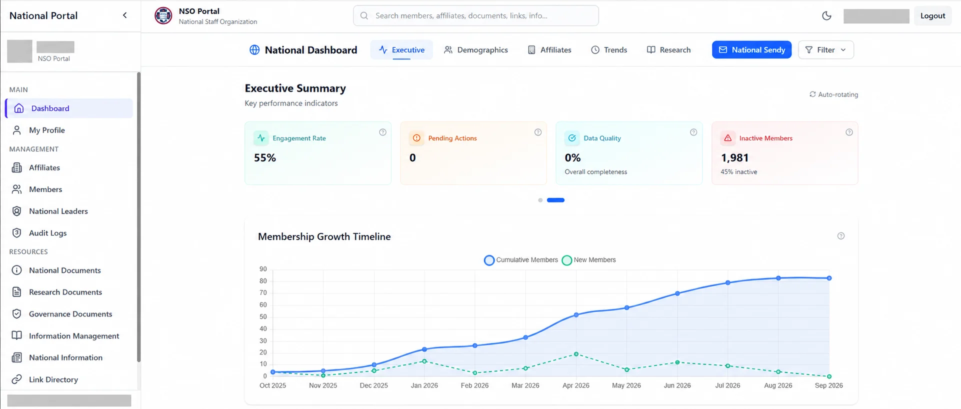
The portal brings membership context, shared resources and research into an operational view. These redacted captures add the behind-the-scenes design to the public-facing example above.
Privacy-edited copy of a screenshot supplied by Tom Hayden. Identifiers have been removed with image-editing assistance; this image illustrates the interface, not a source for precise data analysis.
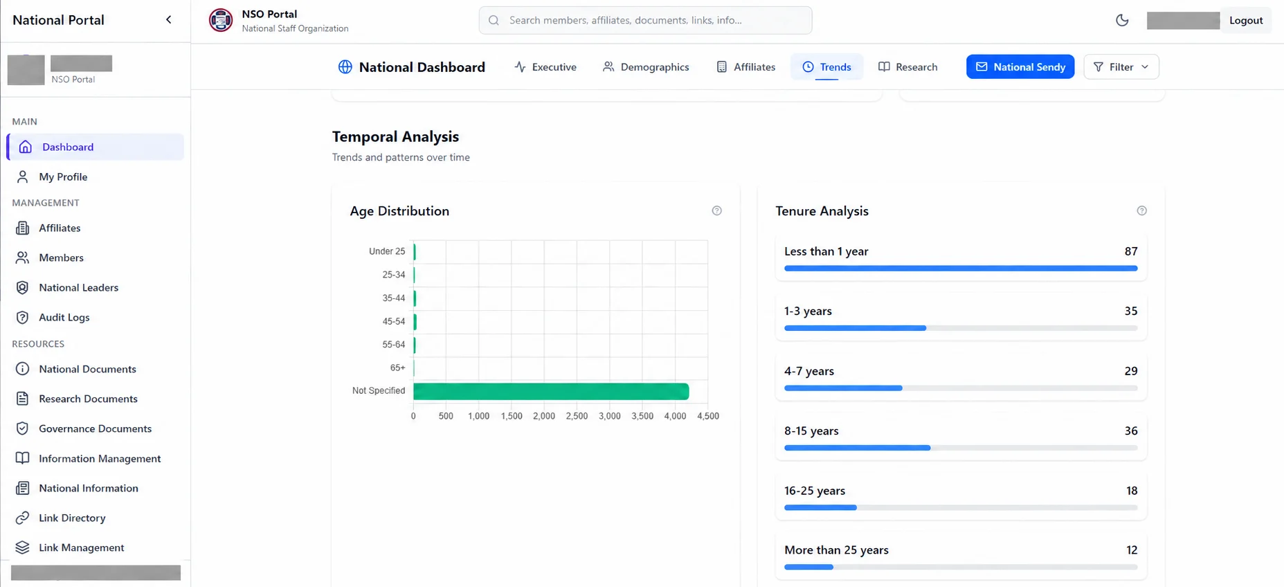
Make gaps visible, too
A demographic view should show what is not known, not quietly fill in the blanks. Missing information is a prompt to improve the data model and invite appropriate contributions—not a reason to assume who members are.
Privacy-edited copy of a screenshot supplied by Tom Hayden. Identifiers have been removed with image-editing assistance; this image illustrates the interface, not a source for precise data analysis.
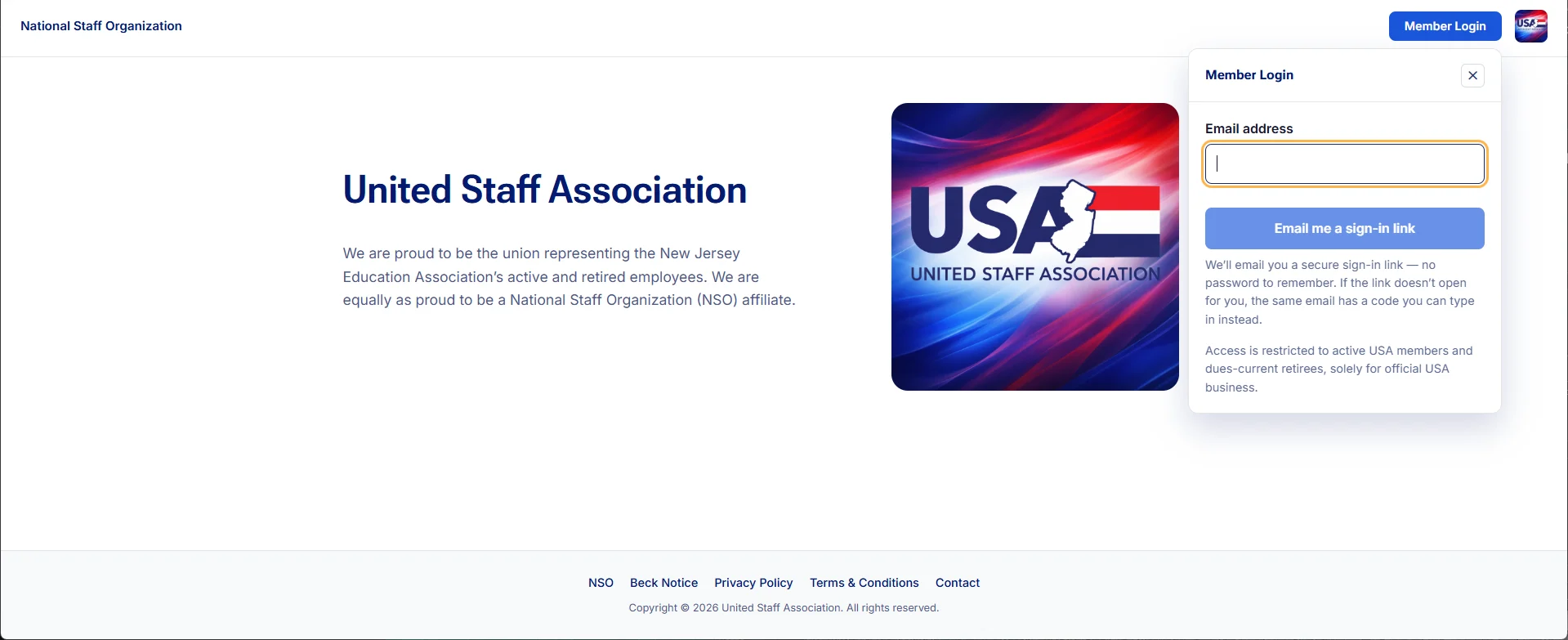
The United Staff Association site brings a member sign-in directly into its public front door.
Actual website or platform screenshot supplied by Tom Hayden. Shown as portfolio evidence, not a live application.
The work
The United Staff Association landing page explains the organization and offers email-based member access in the same view. This is a screenshot of the actual public interface, with an empty sign-in field.
The communication decision
A login screen is part of the member experience. Its language should explain what happens next, who can use it and where help is available. The technology should feel like a familiar organization, not an unfamiliar vendor.
A direction for OneNJEA
Test an email or text verification-code experience with ordinary members, including people who log in infrequently. IS should determine the appropriate identity architecture, recovery process and security controls; Communications can help make the journey understandable.
A practical boundary
This portfolio does not authenticate NJEA members. The example shows a design direction, while private records, role permissions and staff security belong in their governed systems.
What comes next
This case study will grow with a fuller project brief, verified outcomes and additional work samples. Try the interactive data lab →
Inside the member experience
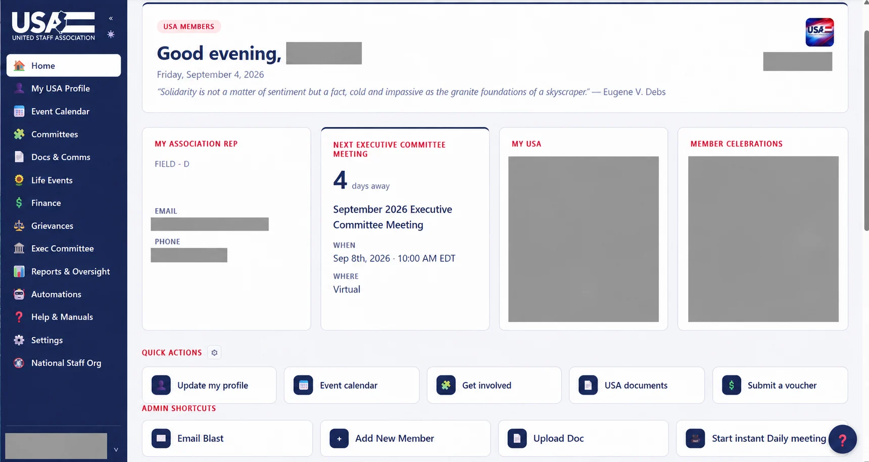
The front door continues into a dashboard: a representative, a meeting, personal context and useful actions. A welcome journey can connect those pieces without making a new member learn the organization chart.
Privacy-edited copy of a screenshot supplied by Tom Hayden. Identifiers have been removed with image-editing assistance; this image illustrates the interface, not a source for precise data analysis.
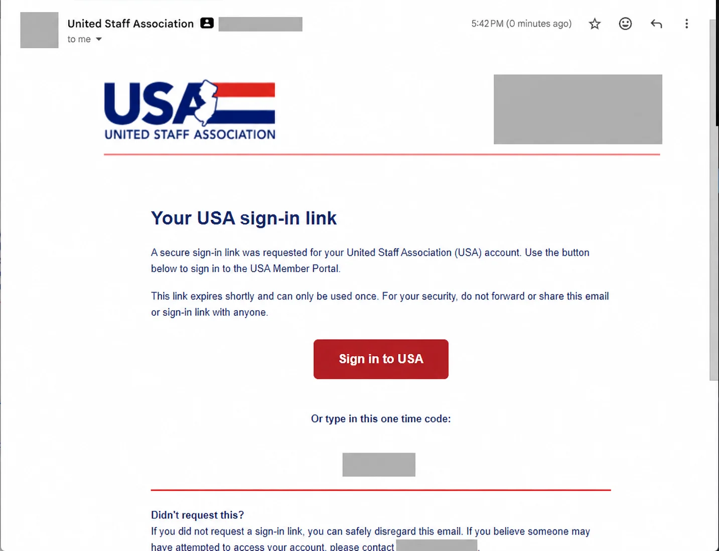
The sign-in message is part of the design
Brand, reassurance and plain instructions should travel together. A production identity review would test email-code and text-code options, recovery and appropriate assurance with IS; the image here does not expose an active credential.
Privacy-edited copy of a screenshot supplied by Tom Hayden. Identifiers have been removed with image-editing assistance; this image illustrates the interface, not a source for precise data analysis.
Useful follow-through
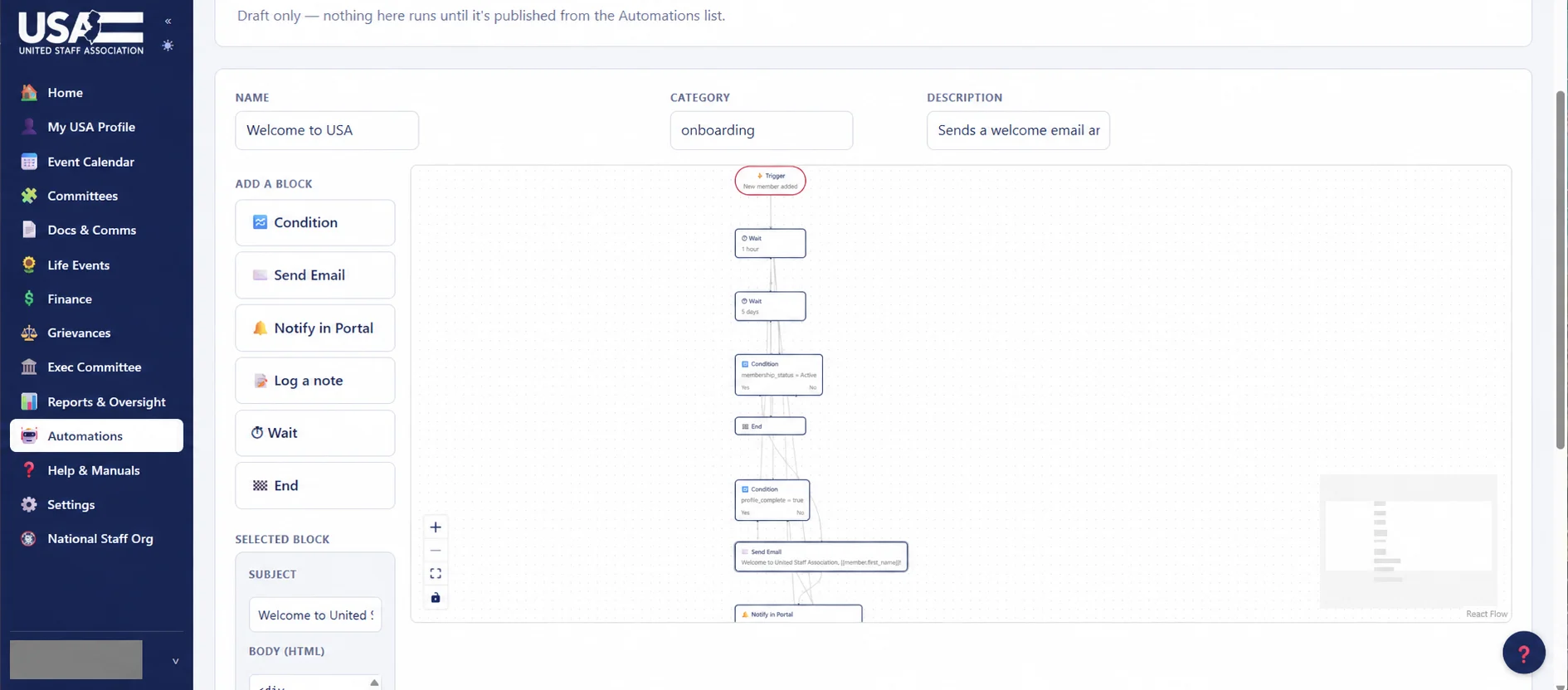
The automation builder shows the shape of an onboarding journey: a trigger, a wait, a condition, a message. The communications question is what belongs at each moment—and how a member can change preferences or reach a person.
Privacy-edited copy of a screenshot supplied by Tom Hayden. Identifiers have been removed with image-editing assistance; this image illustrates the interface, not a source for precise data analysis.
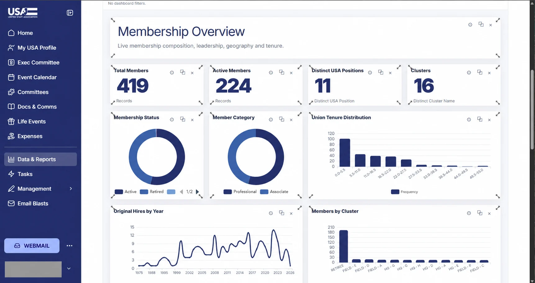
A shared view of the membership
Summary cards and charts make composition, tenure and geography visible. The next step is agreed definitions and appropriate access, so a useful view does not become another competing record system.
Privacy-edited copy of a screenshot supplied by Tom Hayden. Identifiers have been removed with image-editing assistance; this image illustrates the interface, not a source for precise data analysis.
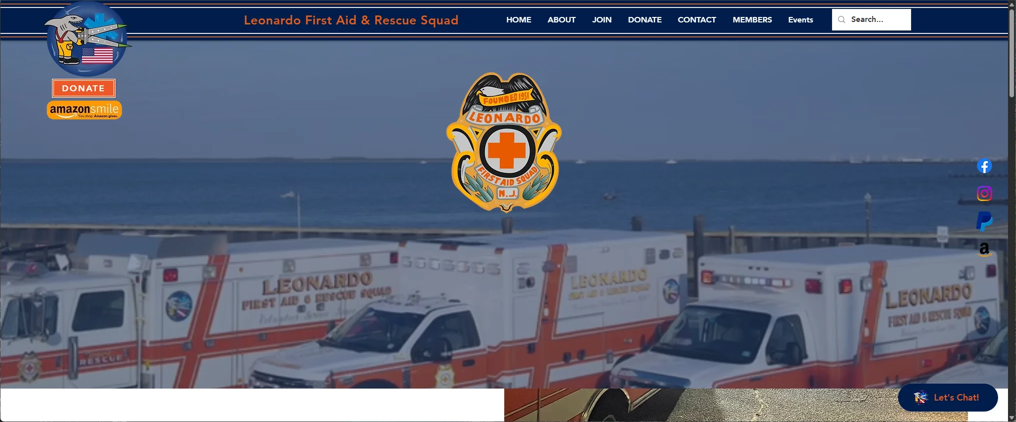
A first aid and rescue squad’s website gives its community recognizable people, places and ways to help.
Actual website or platform screenshot supplied by Tom Hayden. Shown as portfolio evidence, not a live application.
The work
The Leonardo First Aid and Rescue Squad website uses the squad’s own visual identity and ambulance photography. Join, donate, contact and member information are visible routes into the organization.
A different audience, the same discipline
Community communications must be understandable before anyone knows the organizational structure. A person thinking about volunteering needs a clear invitation and a useful next step.
Carry it forward
That same attention belongs on local association sites: familiar identity, plain language, mobile-friendly actions and current contact information. The best shared WordPress foundation leaves room for each local’s character.
A living example
This capture documents a point in the site’s history. Future reviews would check dated promotions, link destinations, mobile tasks and accessibility. No current fundraising results are inferred from the image.
What comes next
This case study will grow with a fuller project brief, verified outcomes and additional work samples. Try the interactive data lab →
Constant Contact reporting connects editorial decisions with delivery, clicks and the next useful question.
Actual website or platform screenshot supplied by Tom Hayden. Shown as portfolio evidence, not a live application.
The work
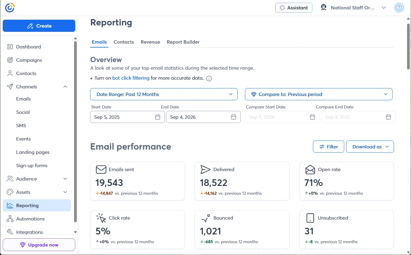
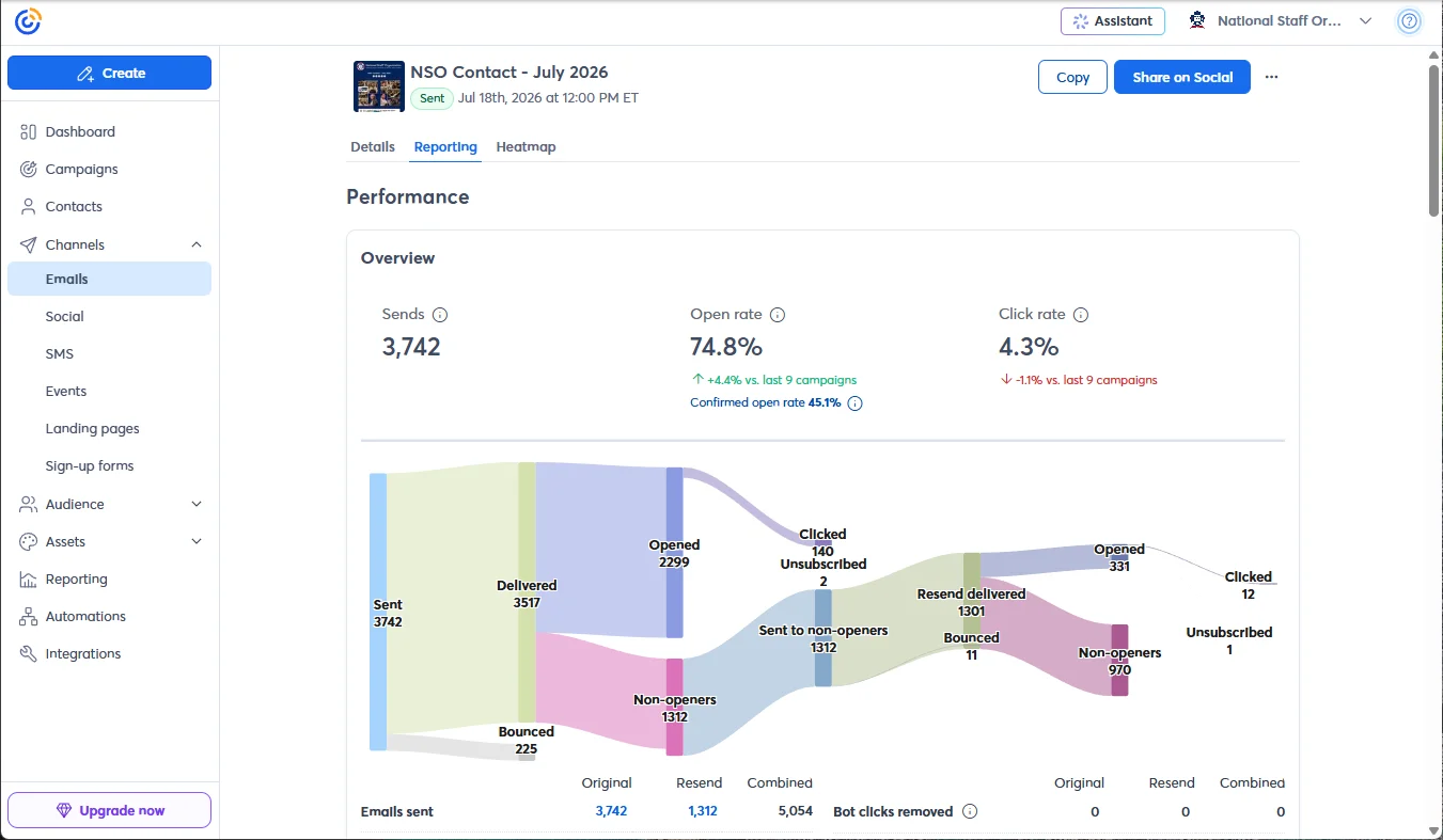
These supplied Constant Contact reports show NSO email activity and the July 2026 NSO Contact campaign. They make delivery, opens, clicks and resends visible in the same workflow.
Read the whole report
The annual capture reports 19,543 sends, 18,522 deliveries, a 71% open rate and a 5% click rate. The individual campaign shows a 74.8% open rate and a separate 45.1% confirmed open rate. These are platform-reported figures in the supplied screenshots, not independent performance verification.
What the numbers can—and cannot—say
Open rates can be affected by automated activity and privacy features. Clicks, downstream actions, delivery health and feedback add necessary context. A high open rate alone does not establish that a member understood or valued a message.
The next chapter
Experience with digital email platforms, including Salesforce Marketing Cloud, informs a broader question: what does a person actually need next? As OneNJEA evolves, governed audience attributes, consent, content preferences and event context can support more useful journeys. Constant Contact screenshots here document that platform; they are not presented as Marketing Cloud screenshots.
Connect without overwhelming
Sendy, Cvent, WordPress and OneNJEA already support parts of the experience. A thoughtful next step is a small, measurable journey: an appropriate invitation, a clear event page, confirmation, follow-up resources and an easy way to change preferences.
NSO Contact — July 2026. Platform-reported campaign results; the original send and resend are distinct parts of the flow.
What comes next
This case study will grow with a fuller project brief, verified outcomes and additional work samples. Try the interactive data lab →